
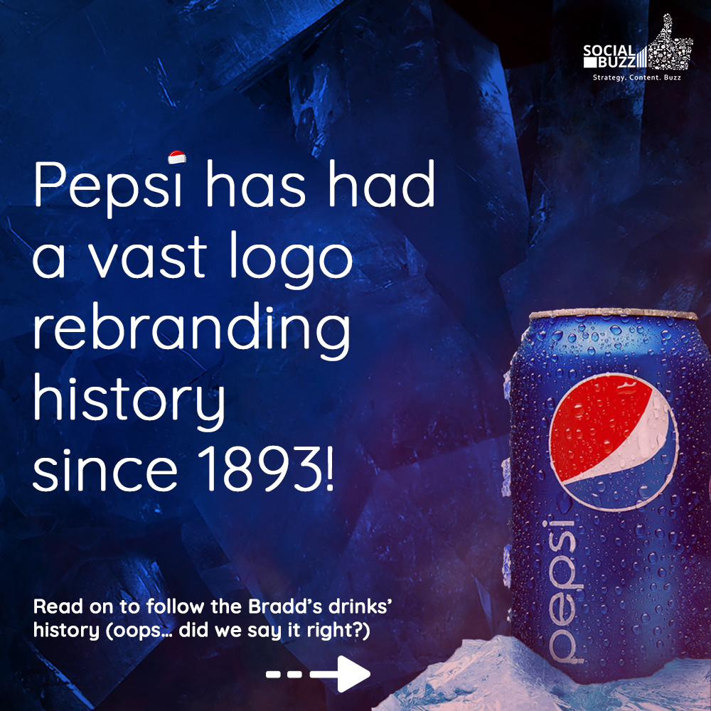
Tracing the rebranding journey of PEPSI

A hot summer afternoon, you go to the supermarket with your mom and the first thing that you see on aisle is this big bottle with black liquid and immediately your ‘dil maange more’. In this blog post of Logo Rebranding series of blog posts, we will be covering Pepsi and it’s logo journey.
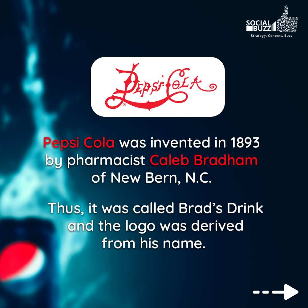
Pepsi is a brilliant example of a brand that managed to stay timeless in spite of multiple iterations to its logo. When Pepsi started it was known as Brad’s Drink in 1893, the logo was a blue WorldMark against a white background. Pepsi held on to the design, color of the logo for a while even after changing its name to Pepsi-Cola.
Later in 1898, Brad’s Drink was renamed to Pepsi-Cola. The name was derived from ‘dyspepsia’, another term for indigestion (those were the times when soft drinks were used for medicinal purpose). The term was trademarked in 1903, and the logo was thin, spiky and red in color.
In 1905, the logo was simplified a bit and the curves were made softer. The letters got bigger and the spikes were retracted, overall the logo was wavy, and the letter ‘a’ retained its coil.
A year later, the logo was changed again, the red colour of the logo was kept, the wavy nature of the logo was also kept and it resembled other cola brand’s logos. In this version, the letter ‘P’ and ‘C’ were made thicker and taller than the rest of the letters. As you will notice, this was the last time a colon was added between the two words.
Pepsi retained this version of the logo with some minor tweaks till 1950 when the primary colour of the brand was changed from red to blue. Now, when we think of the brand Pepsi, we all will agree that we think of the colour blue, it will always be blue for Pepsi vs red for Cola. The colours blue and white had no connection to Pepsi until they revealed their bottle cap logo. The new logo looks like a flag with red on top, Pepsi logo in between and blue at the bottom.
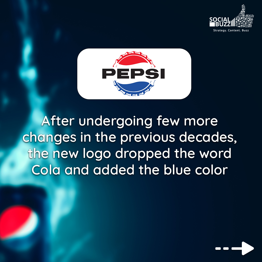
A major change came in the year 1962 when two big changes took place:
- The bottle cap was made flat
- The word ‘Cola’ was dropped from the brand name.
Going forward, it was only Pepsi. The brand also dropped the bright red coloured, swoopy font that they had been using for the past 64 years and instead decided to opt for a simpler black colour font style. With a more minimalist, simpler and standardised logo, the brand was niching down its target audience thus focusing on young consumers, referring to them as the ‘Pepsi Generation’.
Then comes the year 1973, when the brand switched to a more global logo. There weren’t many changes to the logo, just the bottle cap was dropped and a rectangle box was added to its border. For the first time, the brand added a colour background to its logo, with red and blue colours on its left and right, a white-coloured globe was added to symbolise the brand’s global presence. The ‘Pepsi’ colour changed from black to blue and shrank to fit in the circle.
Jumping to 1987, when Pepsi decided to give its global logo a facelift and took a major step. To the world, the logo would look the same, but it was during this iteration that the brand replaced its all-capital sans serif font with its own unique font. The style was the same: bold, sans serif, however, it was more modern and futuristic. The brand continued using this font for over a decade.
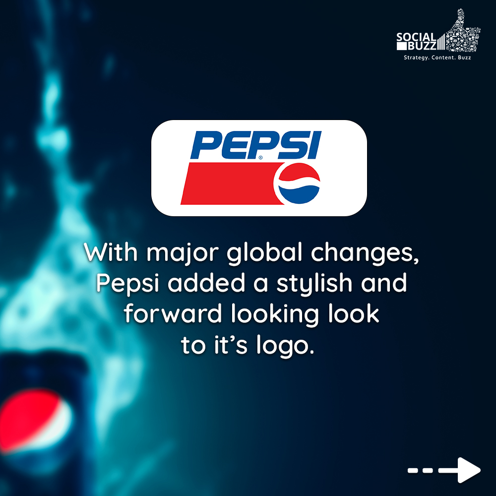
Later in the year 1991, Pepsi decided to shake up things a little. They retained the wordmark and the globe but it was separated from the text. The word ‘Pepsi’ was italicized and the logo shifted to the bottom right and in the remaining space, a red bar was added like the earlier logo version. With the new stylish look, the brand wanted to communicate that Pepsi was a forward-looking and forward-thinking brand.
In 1998, Pepsi flipped how they used the colours in their logo. Instead of a blue text on white background, the logo was placed on a blue background with Pepsi in white. The globe was made 3-D with lights emitting from the sides. For the first time, the globe was not outlined in white.
Logo changes in new century
Coming to 2003, the new logo was tweaked to have white shined spots, to make it look like it is sealed packed in plastic. A blue outline was added to both the globe and the text, which made it look more professional and standardised. Tiny serifs were added to the text and the letters got a little shading, enhancing their 3-D look.
Pepsi was finally declared as the cool soda brand, and they never stopped after that. In the year 2006, the logo actually started looking cool. This iteration had a 3-D globe, the fonts were stylised to look classy yet young. The font stayed the same as the 2003 version, however water droplets were added to both the globe and the font to show freshness and entice thirst in the viewer.
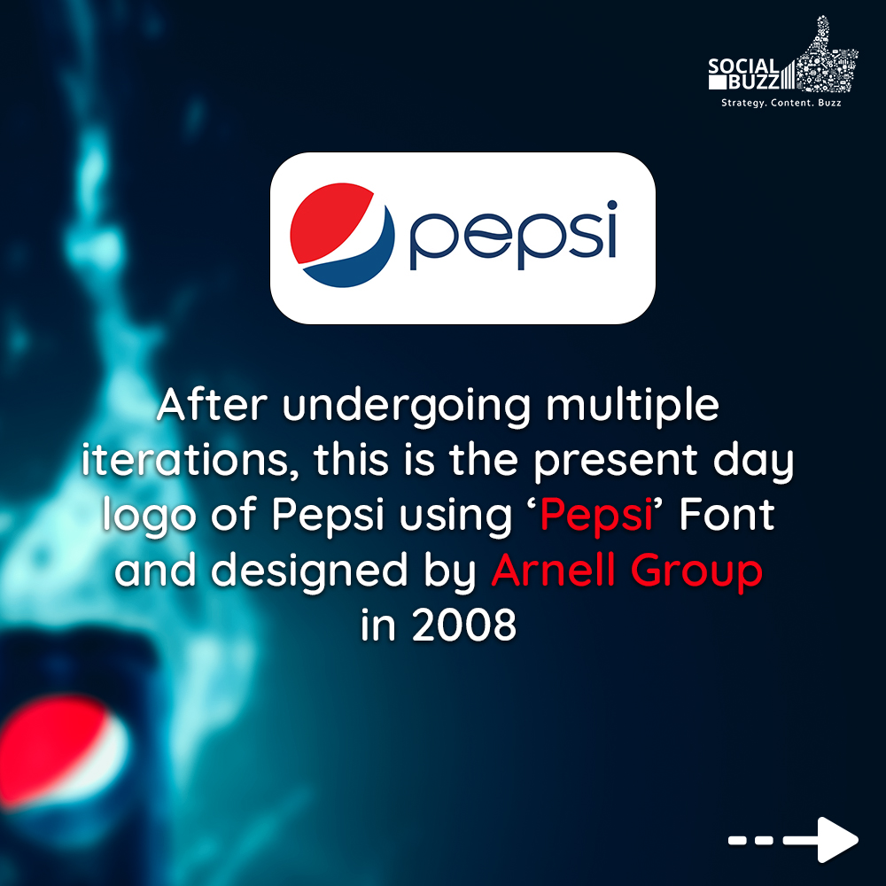
Now comes the year 2008, when the brand paid Arnell Group more than $1 million to design their next logo. The globe was made flat again, the uppercase letter was gone, serifs were no longer used. The new font was more friendly, engaging, unpretentious. However, there were contrasting opinions to the same. For instance, there were many who found the logo lazy, unattractive, too simple, while others called it cheap and soulless. However, despite the public criticism, the brand decided to stand by its choice. Consequently, in 2014, the logo was again tweaked, removing the blue outline around the globe.
No one knows how the Pepsi logo would look like 5-10 years down the line. No matter what happens, the brand will know how to adapt its logo to stay relevant. Pepsi is amongst few brands that have changed its identity numerous times to find what it stands for.

Source of inspiration:
https://www.thoughtco.com/history-of-pepsi-cola-1991656/
https://www.pepsico.com/brands/nutrition


nice in this blog and thanks for sharing information in this blog
I am glad you liked this blog post and found it helpful!
nice blog thanks for sharing information in this blog
We are glad that you loved the post. We love tracing the journeys of brands and their brand identities!
Spot on with this write-up, I really believe that this website needs a great deal more attention. I’ll probably be back again to see more, thanks for the info!