Journey of three-pointed Mercedes Logo

We all have seen this beauty driving past us, some own it while others still dream about parking this diva in their garage. In the this blog post from the series of Rebranding series of Social Buzz, we would be talking about the logo journey of Mercedes. The now-popular three-pointed Mercedes logo is a long-term work that started over 100 years ago.
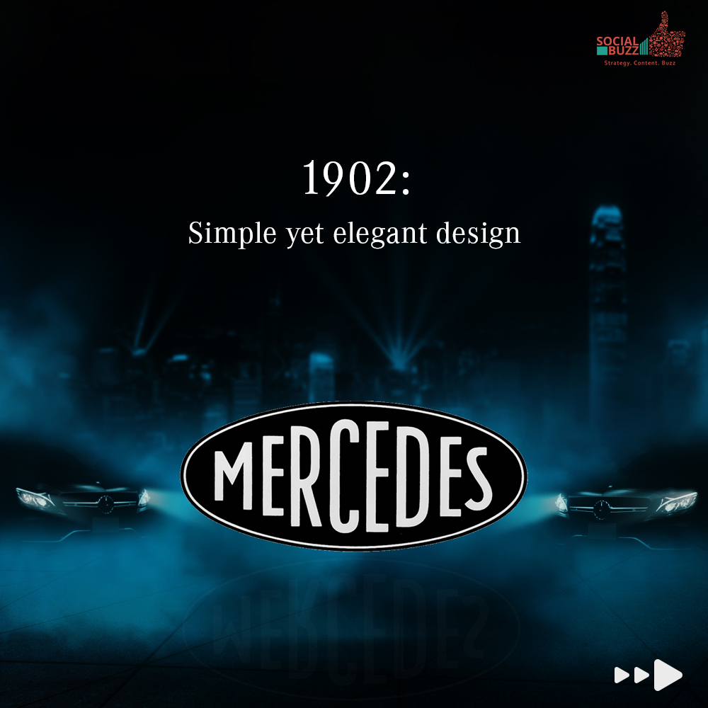
It all started in the year 1902 when ‘Mercedes’ as a brand name was first registered thus giving rise to the brand’s identity. The logo then had a fairly simple design with only the brand name. The font design looked elegant and sophisticated.
Year 1909- The First Logo
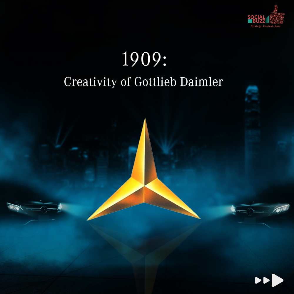
After seven years, Mercedes decided to bring in the 3-pointed logo to its brand imagery. The graceful logo hasn’t been changed to date. The logo was created when Gottlieb Daimler designed a rough image of the logo in a postcard that he was sending to his wife. He even predicted that this logo would bring the company huge success in future, we can safely say he wasn’t wrong.
Year 1916- Redesign of Logo
Four separate three-point stars were added to the logo, the company name was added to the bottom of the logo. This remained the brand identity for Mercedes for the next decade.
Year 1926- Merger of Benz & Cie and DMG to become Daimler- Benz AG
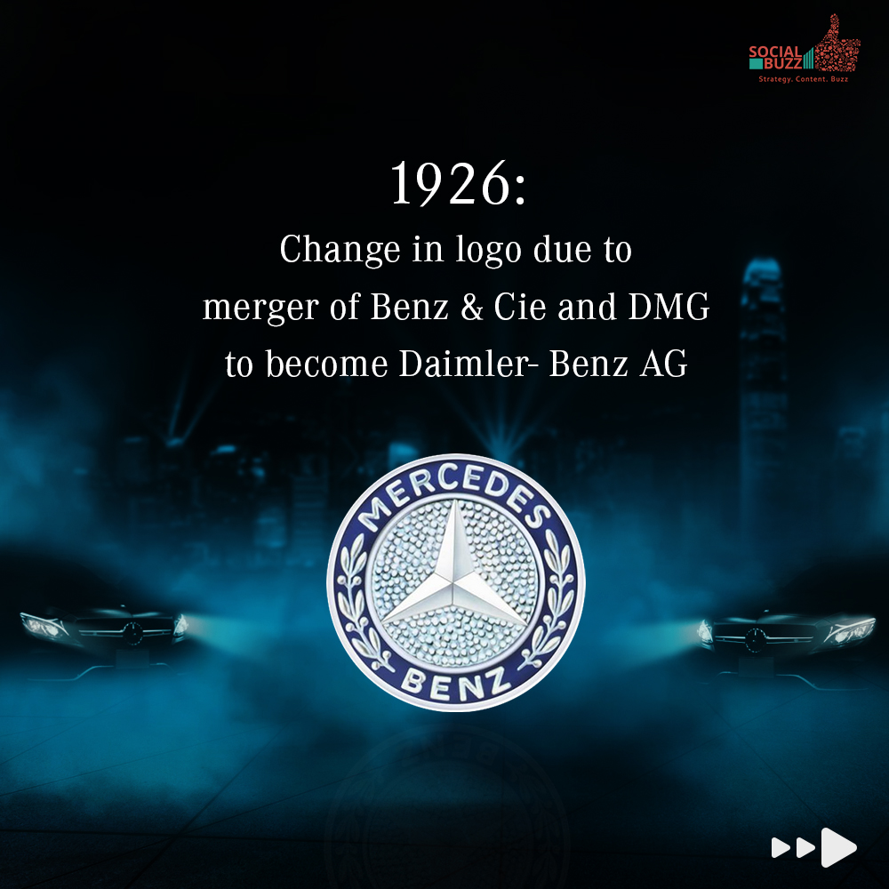
The current version of the logo was merged with Laurel Wreath to incorporate the brand identity of both businesses. The wreath that was once part of the Benz & Cie motors emblem was added and the four three-pointed stars were removed from the logo. The logo was registered under ‘Mercedes Benz’. The word Benz replaced Mercedes from the bottom of the logo and Mercedes moved up.
This logo design gave rise to a complex trademark that reflected the claims made about their products by the two carmakers and also narrated some history behind the company and the brand.
1933- Another Logo was Created
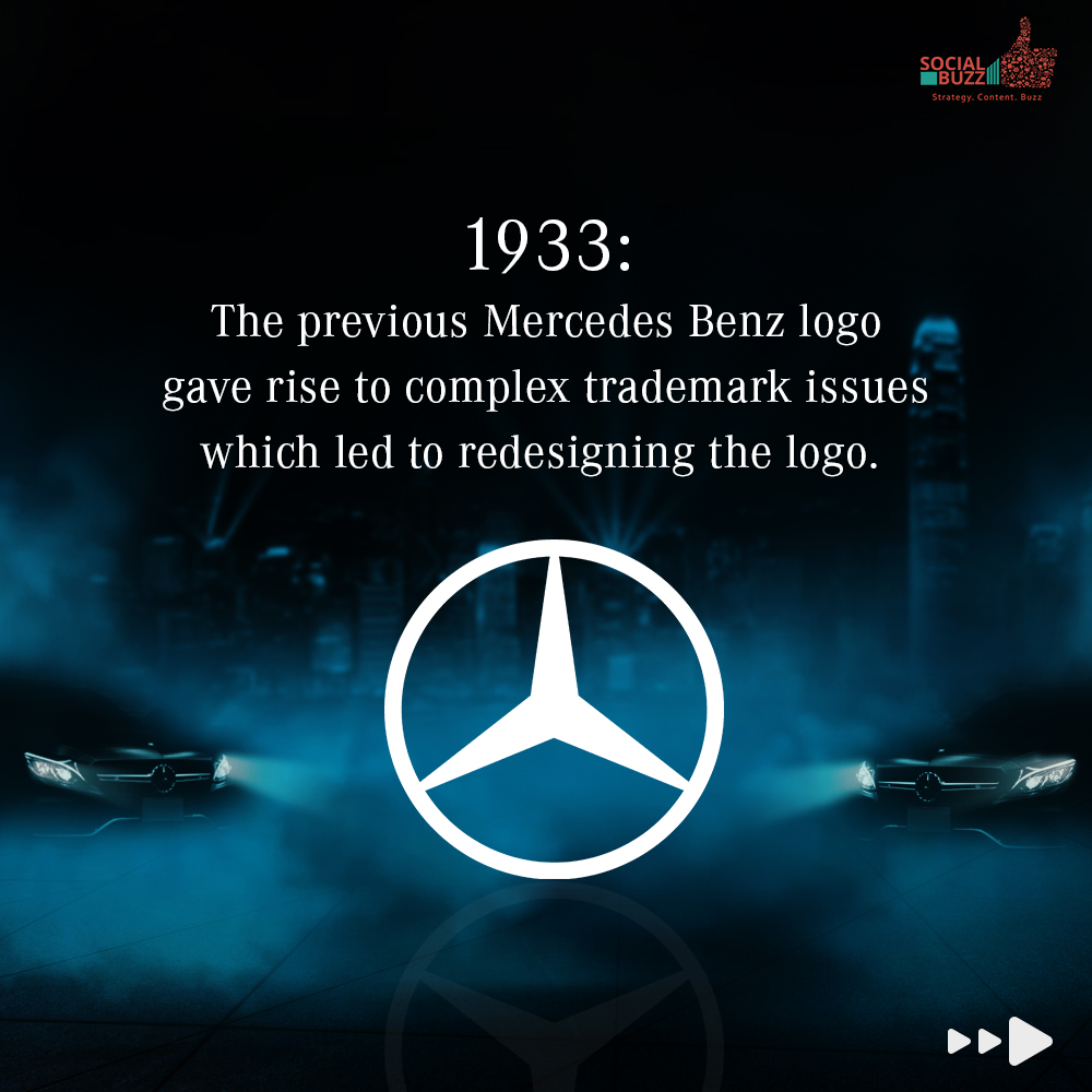
This version was a streamlined form of the emblem comprising a slim, black circle in which the black silhouette of the Mercedes star could be seen. This design was more minimalistic and futuristic for its time.
1989- The Color of the Logo Changes
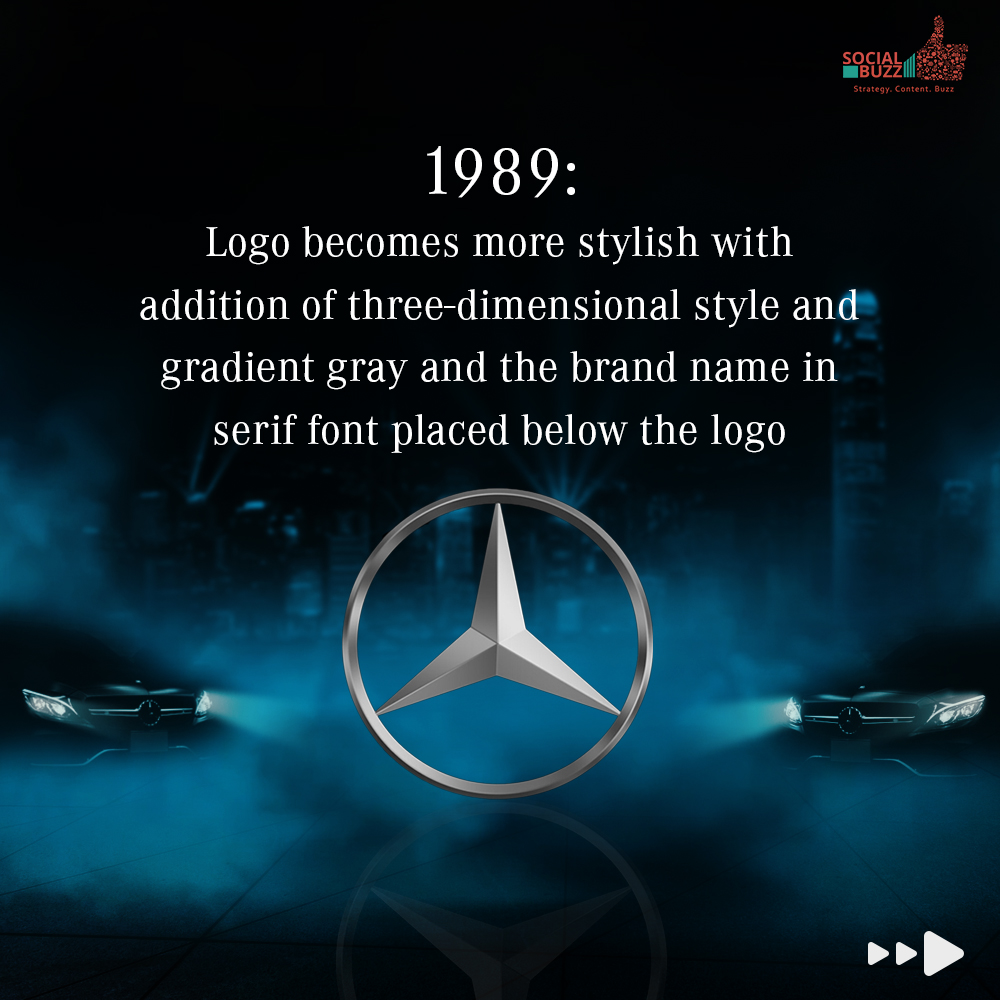
Then comes the year 1989, the logo has become three dimensional and the colour palette for the logo was changed to gradient grey. The brand name was written in Serif right beneath the logo symbol. The entire look is more stylised, chic and classy- a true representation of the brand.
Since Then- Only and Only Minor Tweaks
Since then the logo has undergone some minor tweaks however the overall look and feel has not been changed much. The shiny and sleek image of the logo appeals to the eyes. It is a true reflection of Mercedes brand personality. Besides, the futuristic look represents the companies ambition for a bright and prosperous time. Thee logo is in metallic silver color and the brand has used shades of color to build its corporate identity. But do you not wonder why silver? It is said that silver is the favorite color of elites in the German monarchy, which is why this color was used for Mercedes, signifying their great company mindset.
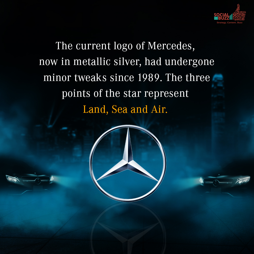
It is no doubt that the three-pointed silver star of Mercedes is as iconic as the M shaped Mcdonalds logo. Even without seeing the brand name, one can easily recognise the brand logo anywhere in the world. The logo represents the ethos, integrity and rich legacy of the automobile company. The three points of the star represent the power of three elemental forces on Earth- Land, Sea, and Air.



Comment (01)