Building the Logo for Lego

It is difficult not to feel lost in an array of thoughts, when one hears the brand name, LEGO. For decades altogether LEGO signifies creative imagination and cutting edge innovation. From a small carpenter’s workshop to a modern, global enterprise that is now one of the world’s largest manufacturers of toys, LEGO has come a long way over the past almost 90 years. Introduced in 2010 in India, this brand is every American Kid’s favourite. In this blog post under the series of Logo transformation of iconic brands, we are taking you to the logo journey of Lego. The red and white logo is worldwide recognised by people of all ages. The company started in the year 1934 with an ordinary black and white text logo. And since then the company’s logo has gone multiple iterations to be the version that we see today. The word ‘Lego’ has two meanings. It’s derived from the Danish word “leg godt” which means play well, and in Latin, it means “I put together”.
1934: The start of the Journey
1936: A little Tweak
In the year 1936, the brand logo was tweaked a bit to include the words ‘Fabriken’ (“factory”) and ‘Billund’ — the factory’s location in Denmark. This logo was even imprinted on the surface of the legos toys.
1946: Expanding for a Global Reach
Moving forward to 1946, Lego as a brand began to dream for a more global reach. The same could be observed in its logo when Denmark was written in English rather than Danish. The logo was coloured and had a 3D look to it, giving a more playful vibe like a toy.
1950: One More Change
In 1950, another drastic logo shift happened. This version was circular with a thick black border around it on which the company’s location was written. Surprisingly, the location ‘Denmark’ was written in Danish as ‘Danmark’. Although this iteration wasn’t as playful, this surely was an attention-grabbing logo.
1953: Building from here
At this point, in 1953, the Lego group was growing rapidly. The company expanded to Germany, marking the beginning of the white-coloured international expansion of the brand. This logo version is the first form of the present logo, with bubbly white-coloured text font, and red background.
1960: Growing Bigger and Better
The 1960s was the time for further solidification of identity and growth for the brand. It was the time when the company discontinued making wooden toys because of the fire that burned down the wooden toy warehouse. The company underwent multiple changes and thus to emphasise the structured system of products, the word ‘System’ was added to the logo in yellow and cursive style. The red background was retained but the shape was changed from eclipse to a rectangle.
1964: Bring in some Colours
The year 1964 saw yet another change in the logo. The previous logo was retained, only the rectangle was changed to a square. There was another square that was added next to the logo, and it compromised of multi-coloured vertical bars. This signified the colourful options of LEGO bricks and also encourage imagination and play. This was the first logo to have the registered trademark symbol for ‘LEGO’.
1972: Making a Standardised Logo
Jumping to the year 1972, when Lego was enjoying widespread growth and success, thus becoming a poplar household name. During this time, the second multi colored block was removed and ‘System’ was also removed. The fonts were made more curve and a yellow outline was added to mark brand uniformity across the globe.

1998: One Last Time
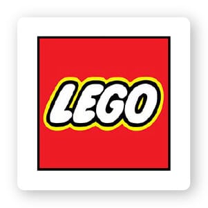
If you carefully look at the logo, you will see the brand name written in an original bubble-shaped font, also known as ‘LEGO font’. The letters are white in colour and surrounded by a black and a yellow colour border, and are set against a red background. The story goes that this red background -especially its shape is a nod to the company’s square blocks that they are famous for. The most important consideration for the brand was to make the logo eye-catching. Hence all the colours, a font that was used was chosen keeping in mind its target audience- children. They are not the most discretionary of consumers, hence having an attractive display was of high importance for the brand.
Lego has been around for a long time, and one thing that helped the brand become a popular and well-known household name was the uniformity in the brand logo. Although it has undergone numerous iterations, its essence was captured in the year 1953. The logo, that has always been simple, unique and eye-catching, and thus has stood the test of time.
Source of inspiration: https://www.lego.com/


Comment (01)