Starbucks Logo Evolution

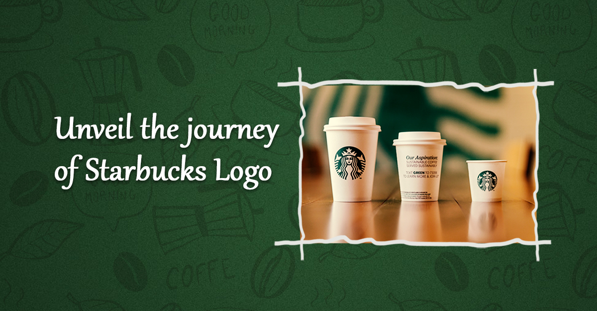
What’s better than freshly brewed coffee from your favourite coffee shop? You guessed it right, in this blog series, Your Brands and their Logo Journey, we will be writing about Starbucks. Just like the brand that has gone a long way from being a small retailer to an international brand, its logo has quite a journey in itself.
Started in 1971, like a local coffee bean retailer, its foremost logo was unique in itself. It had a two-tail mermaid figure inside a dark roasted coffee colour circular ring. The colour that was chosen stimulates appetite and is related to nature, nurture and stability. The design was copied from a woodcut: a naked Siren with a luxurious bust and a crown on her head, holding her two tails in her hands.
The logo was further tweaked in the year 1987, where the colour of the logo was changed from brown to lush green to demonstrate growth, prosperity and a fresh start. The company faced outrage from society for the naked chest of the sea diva. Hence the mermaid was stylised and her chest was covered with her wavy hair. There were two stars placed on either side of the logo to make it connect with the company name.
In 1992, the thriving business was again forced to change the logo under societal pressure- hence the part below the Siren’s navel was chopped off from the logo and she was updated and repositioned to display only the part above the navel. This version of the logo is still referred to as the secondary logo.
In 2011, while the company was celebrating its 40th anniversary, the in-house design team partnered with the New York-based global creative consultancy, Lippincott, for a logo redesign. The Starbucks name was removed, the new logo was a step towards minimalism and intentionality. The siren in the logo was a symbol of being good to people and the world. This is also a reflection of the caution take while sourcing the raw materials at Starbucks, the way they treat their consumers and partners.
Siren had become the main focus of the logo- the eyes, hair, nose and positioning of the face were all radically changed. It was placed in an asymmetrical position, to make the siren look more approachable and realistic.
The new logo is aimed towards bringing together modernity with the tradition and values of American Society. The green colour and the path of minimalism are a tribute to the brand’s decision to take the ecological direction, aimed at preserving the environment.
However, the initial logo helped the brand grab eyeballs right from the start. The unusual and bold picture of Siren attracted people and made them talk about the brand. The history of the Starbucks logo is even studied in design schools as a classic example of the combination of a smart marketing ploy and visual language of information presentation.
The iconic logo has garnered prestigious design awards for its futuristic design and intricate details. It has evolved from a highly detailed logo to a simple green logo that we see today.
Starbuck’s success is mostly attributed to its worldwide renowned logo, hence having a good logo is important for any brand’s success, a good logo should not only speak about the past but also should talk about the future.
So next time when you walk into a Starbuck Store and have your favourite cup of cappuccino, remember to think of the story behind that green logo on your cup of coffee.


Aw, this was an incredibly good post. Taking the time and actual effort to make a very good article… but what can I say… I hesitate a lot and never manage to get anything done.